Explore St. Louis
Redesigning Navigation and Enhancing Information Architecture
ExploreSTL was a long-term client in need of a site refresh, particularly the menu design. In my discovery, I determined their needs superseded a mere visual retouch, and recommended analyzing the architecture from the ground up. The result was a brand new site structure, navigation, and enhanced visual design to bring them up to modern best practices.
Overview
I began discovery by auditing the existing site for pain points. The existing site suffered from a lack of informational hierarchy, in particularly the menu design. Content had been added over the years without a clear strategy, leading to a mega menu that was confusing and thrown together.
Once I communicated this with the client, they chose to expand their role in the project and revisit their content entirely. This gave me the opportunity to help guide their content organization with accessibility and findabiliy in mind, instead of pure marketing strategy.
The site structure had grown over the years without a cohesive strategy. To understand how disjointed the existing architecture was, I mapped out the entire site.
Once the current-state architecture was mapped out, I compared popular pages from each category to look for patterns in user behavior.
Information Architecture
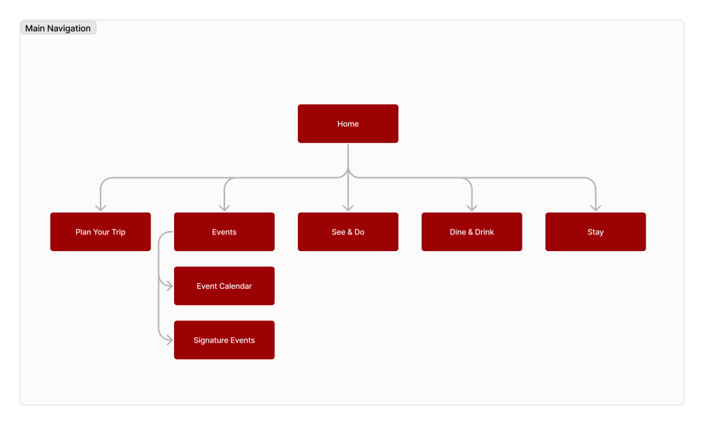
The site structure had grown over the years without a cohesive strategy. To understand how disjointed the existing architecture was, I mapped out the entire site.
Once the current-state architecture was mapped out, I compared popular pages from each category to look for patterns in user behavior.
The site data revealed that marketing initiatives were driving most traffic, and users took many paths throughout the site before exiting. This data, along with the large number of pages and page types, led me to recommend a mega menu as opposed to drop down menus.
Another revelation from the analytics data was the segmentation of user types. Most visitors came from marketing campaigns to general tourists. Other visitors were seeking more specific information regarding event organization and venues. This led to the decision to create a secondary navigation.
Research & Analytics
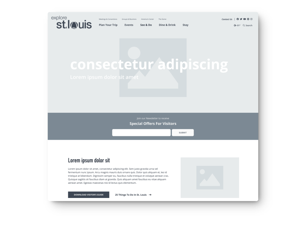
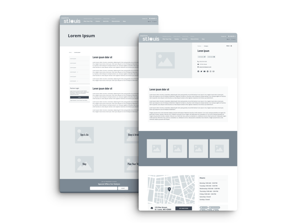
Once the site architecture was approved, I began wireframing main pages. A site this large, made up of hundreds of pages for parks, restaurants, events, and other tourist attractions, required developing scalable templates.
As a trick to ensure scalability, I took the longest, shortest, and median character length titles for every partner page for use in wireframing. This allowed me to confidently design the UI without running into issues with content fitting my design down the road or in development.
Wireframes
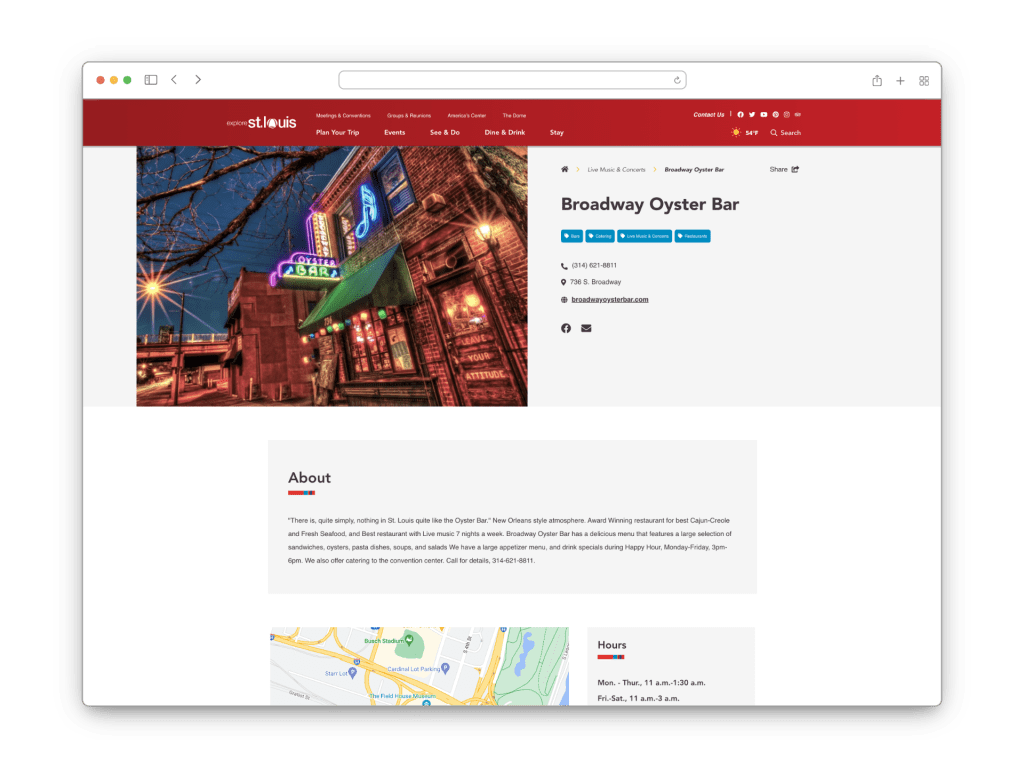
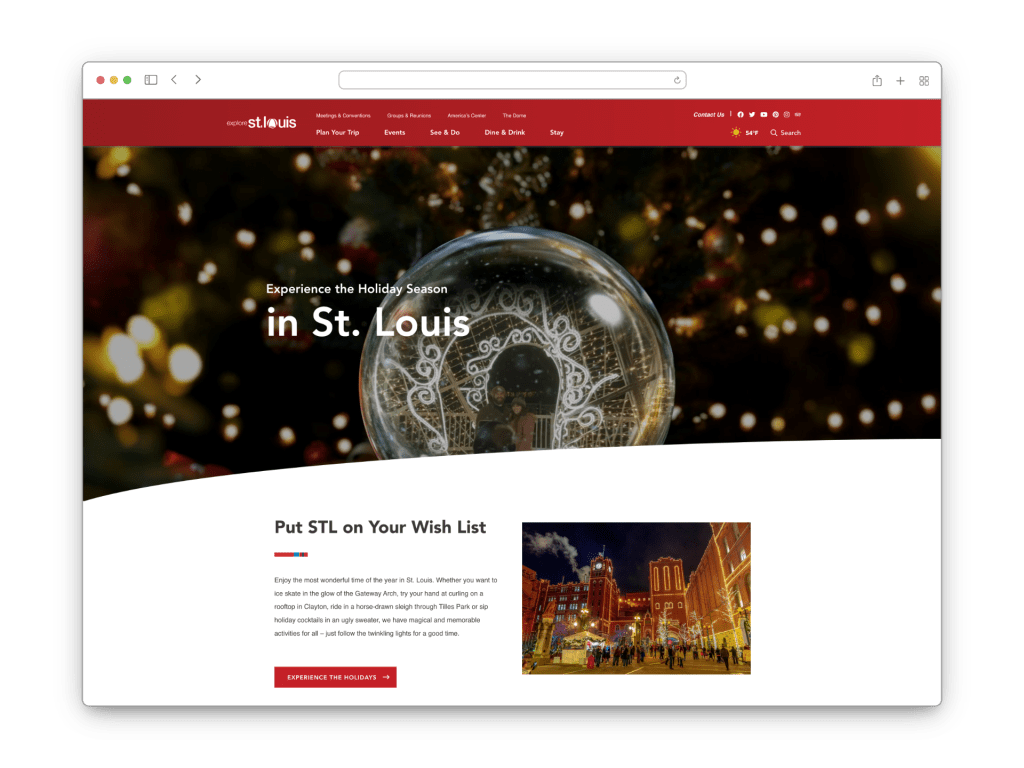
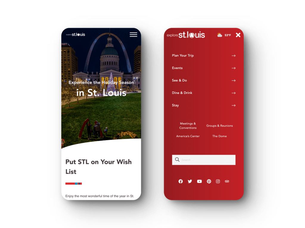
Explore St. Louis already had established brand guidelines, but felt the current site didn’t make use of their alternative colors. The client also posed alienating existing users as a risk, so the overall feel of the site would remain consistent. For these reasons I chose to simply update the existing visual design to better align with modern best practices.
Design
