Fight Colorectal Cancer
Developing an accessible and informative AI chatbot for Fight Colorectal Cancer
FighCRC, a non-profit advocacy group for colorectal cancer patients and survivors wanted to create a live chat feature to help guide visitors through their resources, answer questions related to colorectal cancer, and point users towards content that may help them.
FightCRC received a large donation with the hopes of developing an AI chatbot to assist users in information about colorectal cancer. The original scope was very loose and gave me a lot of room to build an optimal experience for their user base.
The main goals going into the project were:
- Safety and Accuracy
- Accessibility
- Easy to use and understand
Overview
The client was primarily concerned with users understanding how to use the chatbot. Though it would be built with the very popular GPT API, my research at the time showed only 4% of Americans had ever used ChatGPT, and the client’s user base scales older. I initially imagined a wide landing page with a field front and center, and leveraging autocomplete to help users formulate questions.
During the ideation phase, we ran into a few roadblocks for this intial concept.
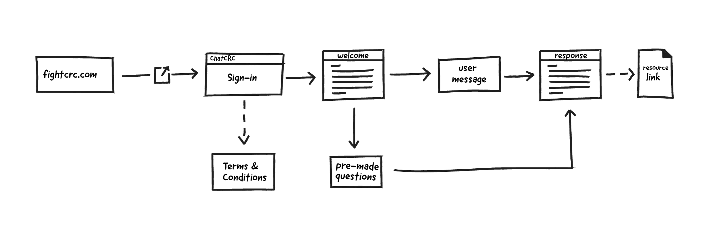
- Users must agree to OpenAI’s Terms of Use
- The client wanted to capture user emails before they interact with the bot
- The client was concerned users would not understand the concept and how to use the bot
To accommodate this, I abandoned the full-width text field for a modal introducing the tool, how to use it, an email gate and terms of use checkbox.
Ideation
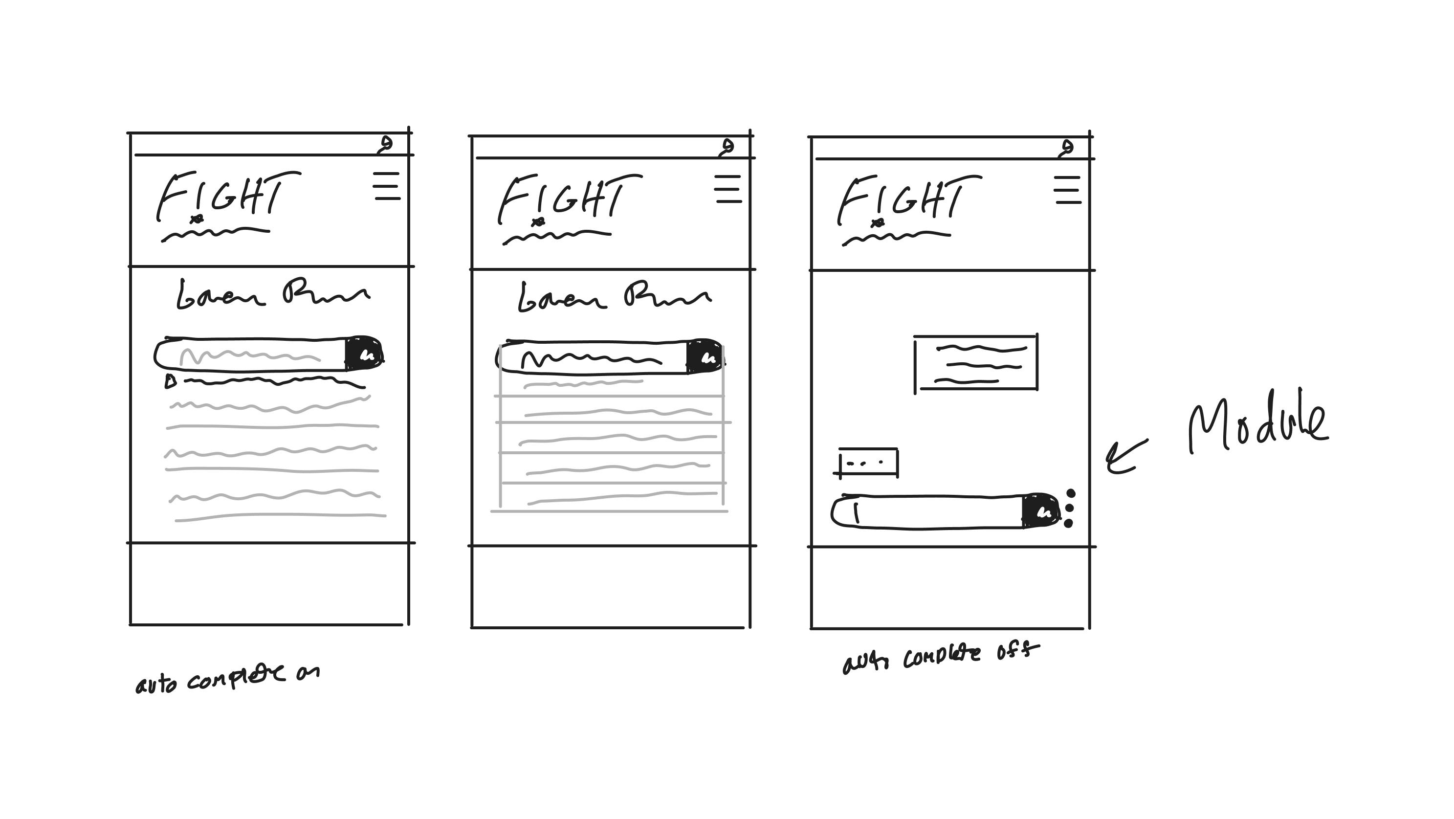
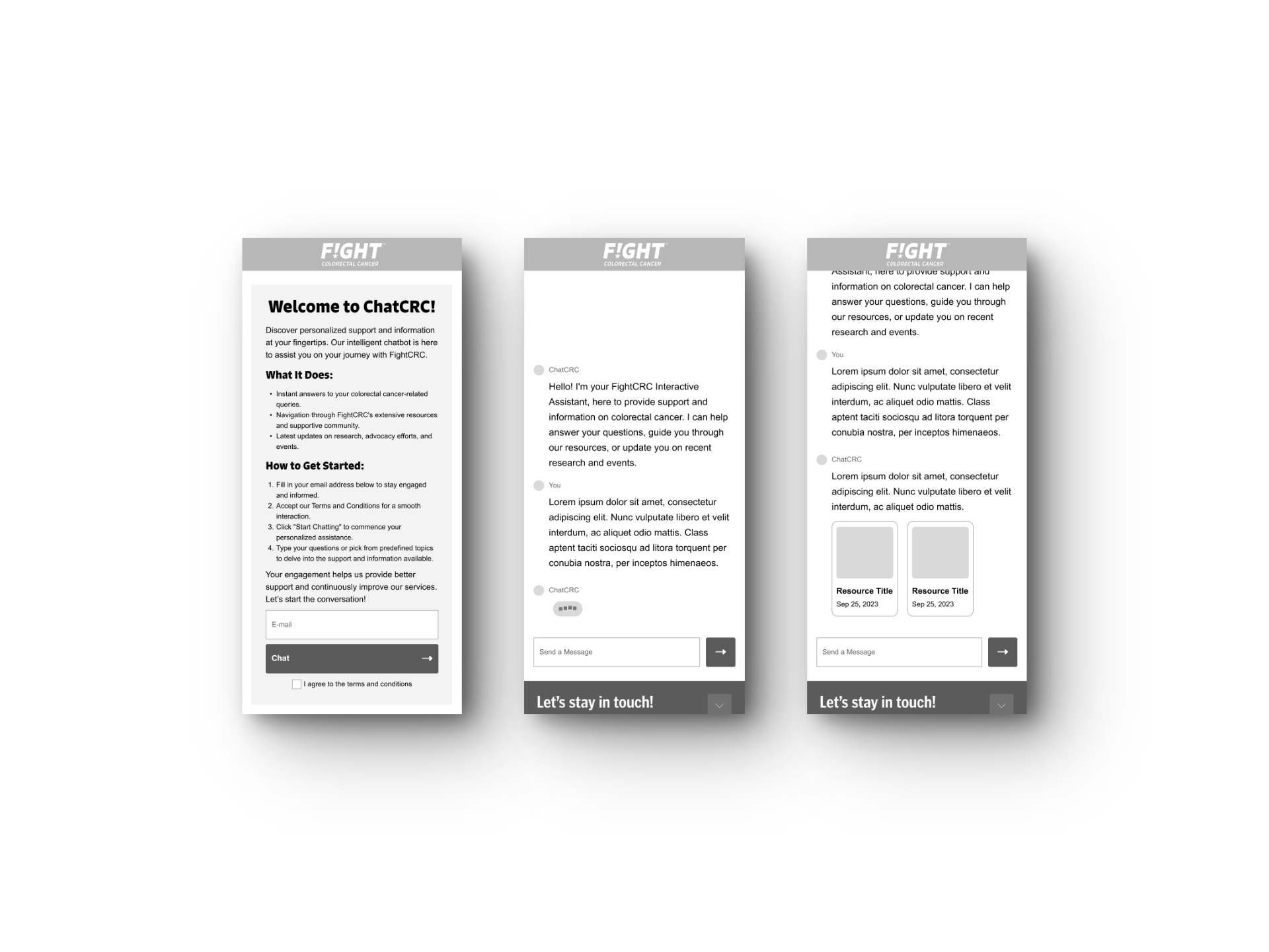
Once the scope and requirements were better defined, I developed mobile and desktop wireframes to visualize the product. To assist in accessibility, I added an informative welcome message from the bot once users enter their email and agree to the terms. Though the client approved, I felt the large wall of text was too intimidating and too much to read, adding an opportunity for users to exit the tool.
Wireframing
During the design phase, I chose to move away from the wall of text email gate and educate users more subtly. I was reminded of the level design for the original Super Mario.
The game doesn’t include and how-to or text instructions on the first level. Instead, the developers guide users by placing objects and negative space intentionally, encouraging players to explore controls and interact with objects.
Using subtle guidance can be more effective than text instructions because it allows users to explore the interaction for themselves.
Ideation & Design Strategy
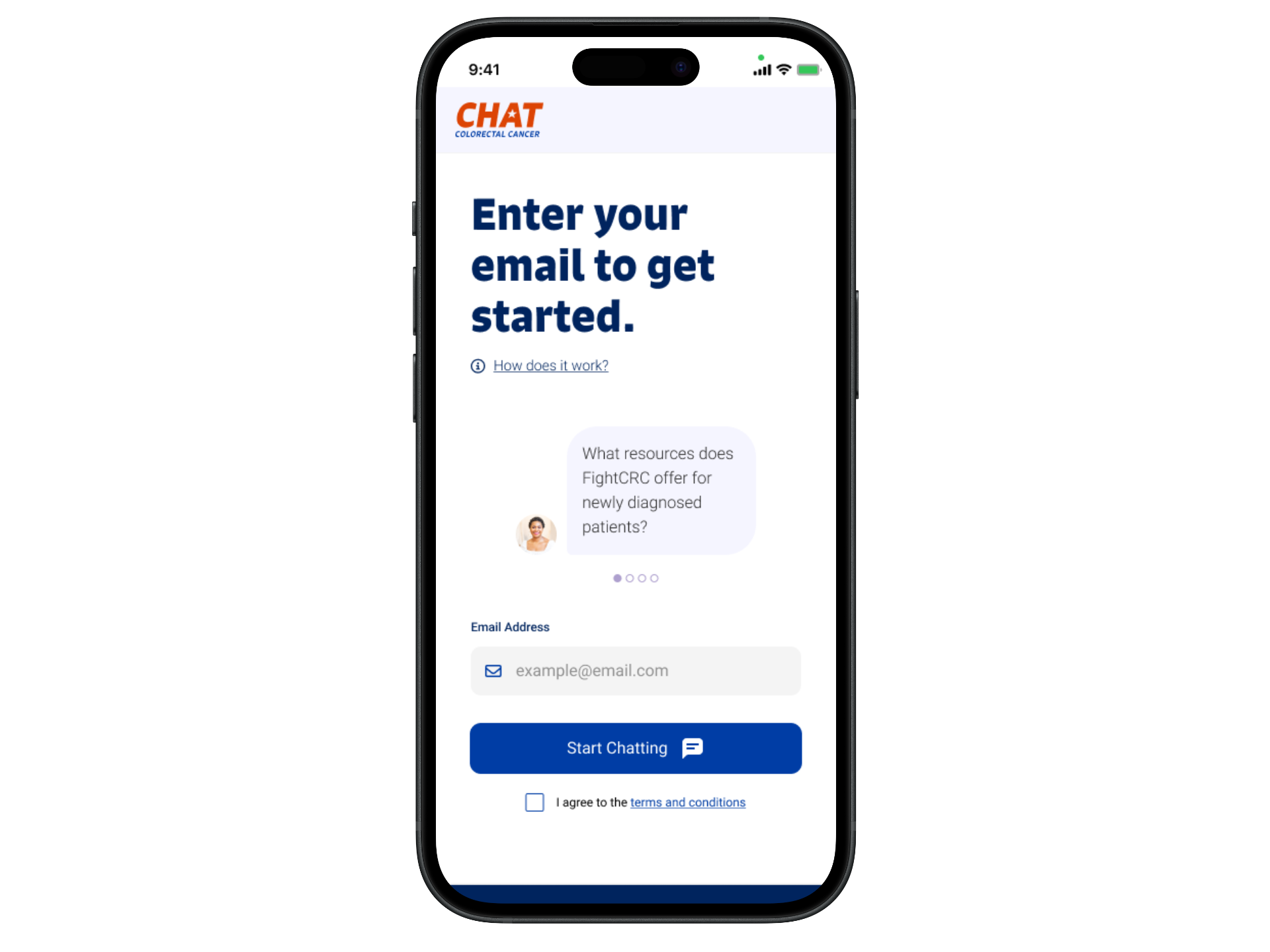
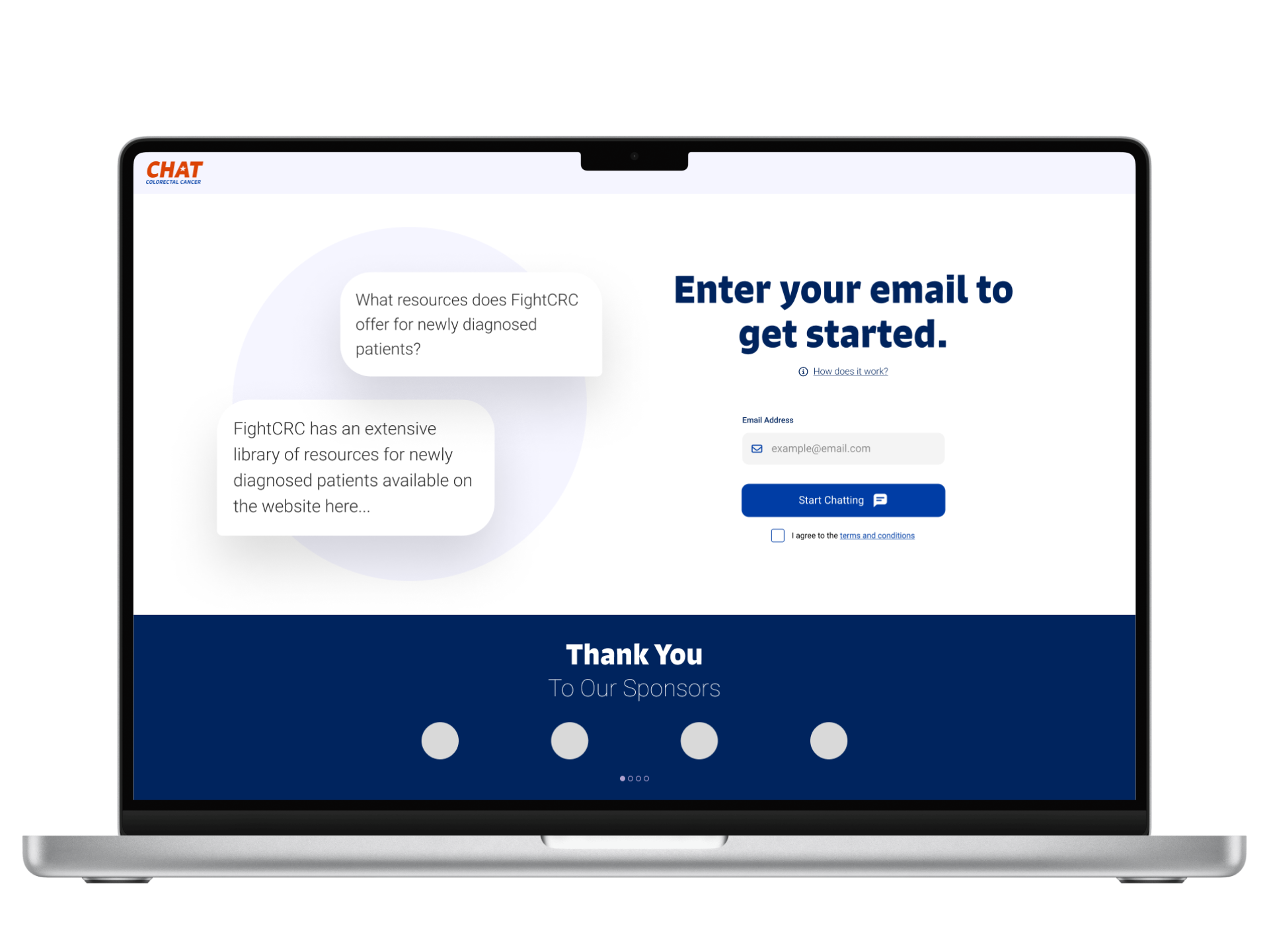
The redesigned landing page features a new logo calling out the chat feature. The H1 instructs users how to dive in to the tool, but there’s also an information link below to request more information. This replaces the carousel with a small bit of text introducing the tool.
The carousel includes four potential questions users may ask the chat. I also chose to make these questions appear as messages with profile pictures. This tells users that humans interact with this tool by asking questions. Below all this information is where users enter their email and agree to the terms of use.
Iterations
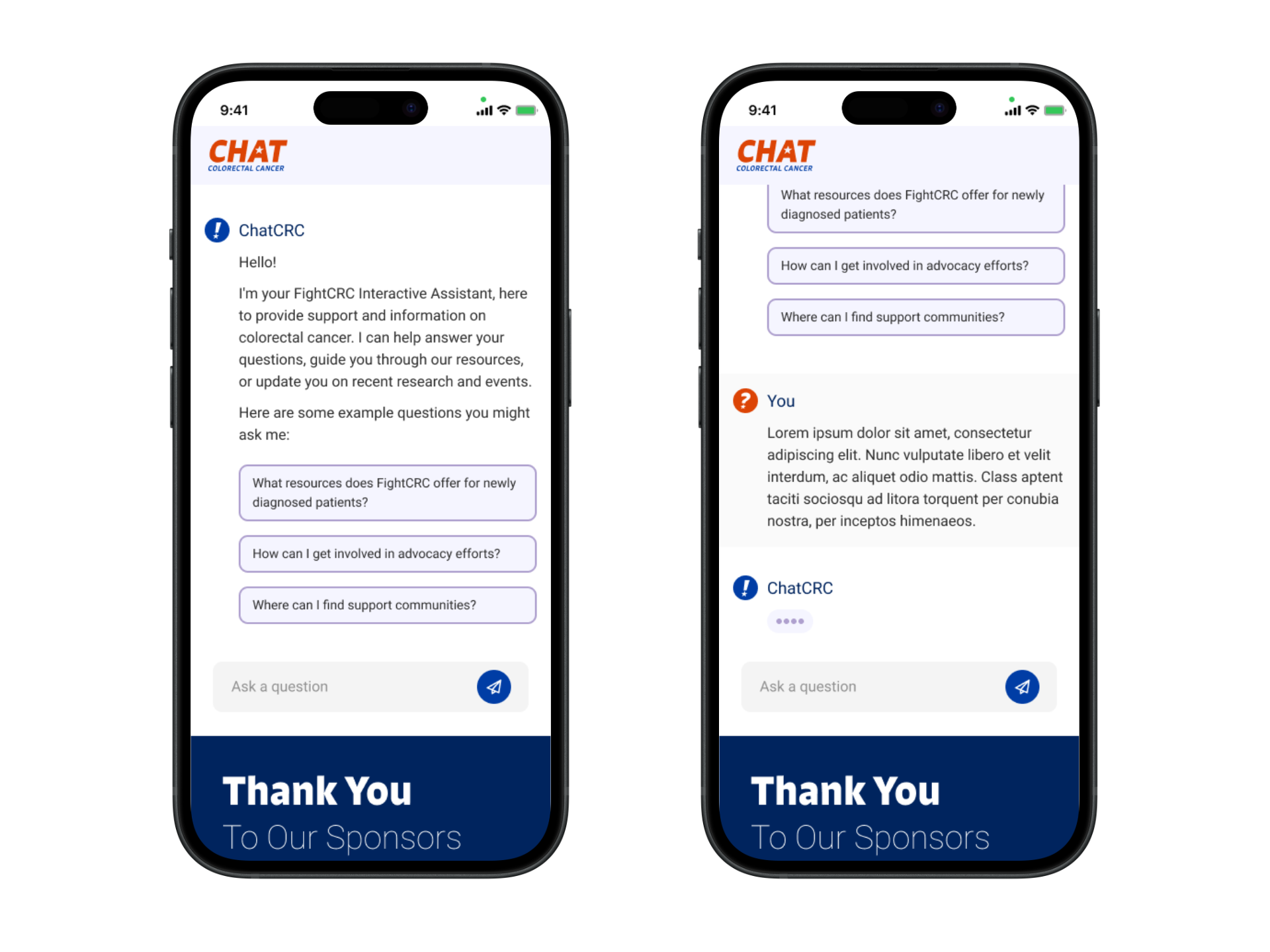
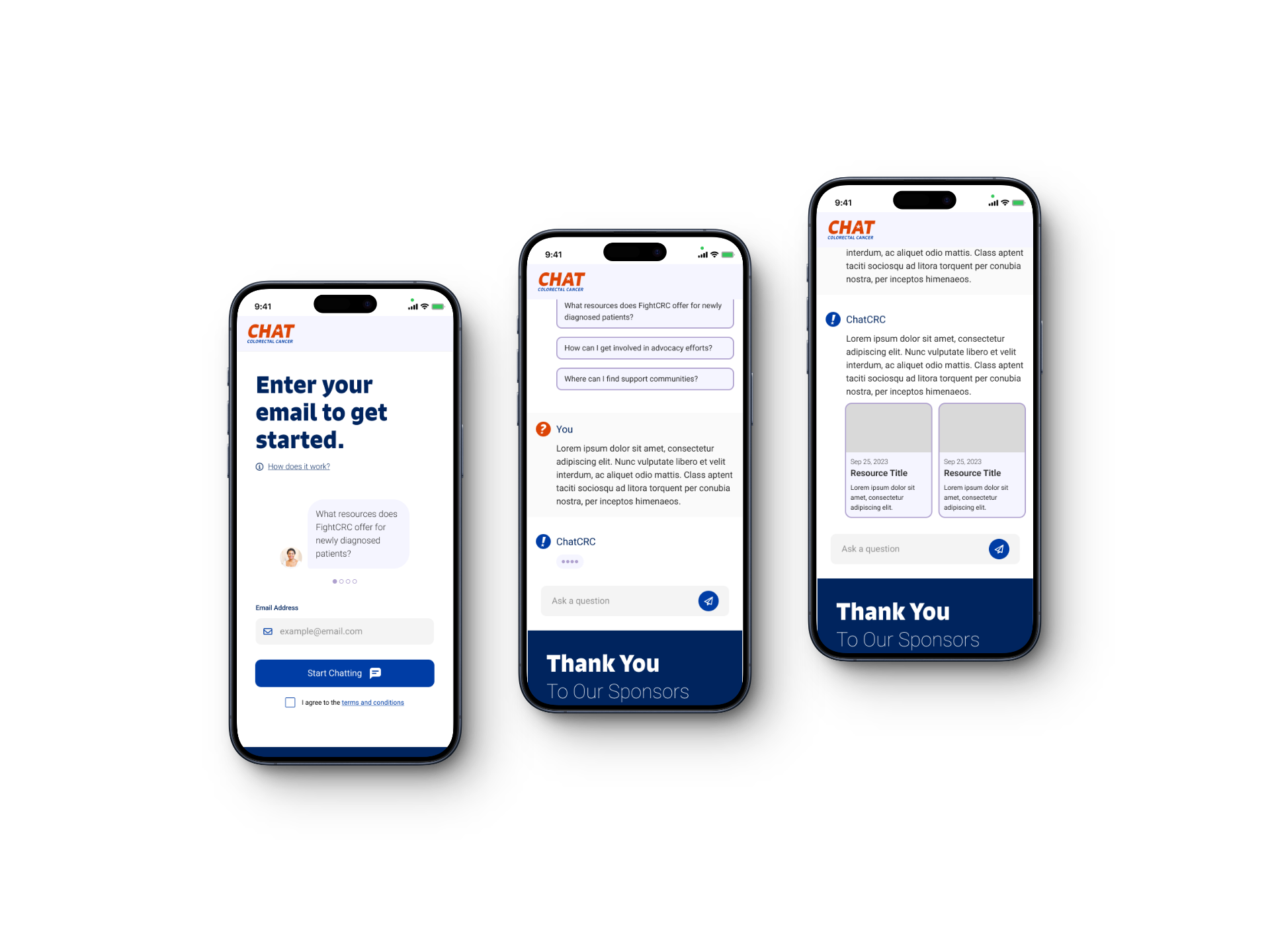
Once users enter the tool, they are greeted by a similar introductory message along with buttons featuring sample questions. I gave the chat a blue avatar with the exclamation point from the FightCRC logo to let users know they’re interacting with FightCRC.
Once the user selects a pre-made question or types their own, they see their own profile picture as red with a question mark, contrasting the Chat’s photo. I also gave the tool a loading animation as if the bot is typing so users know something is happening even though the bot isn’t replying immediately.
because it allows users to explore the interaction for themselves. I then redesigned the landing page following these principles.
Iterations